| New Chalk Paint® by Annie Sloan Colors are out NOW! April 15, 2025 Celebrate 35 creative years of Annie Sloan with us! 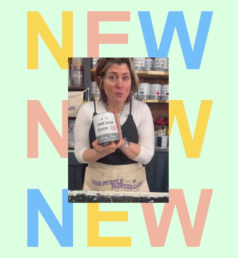 CANVAS CHALK PAINT 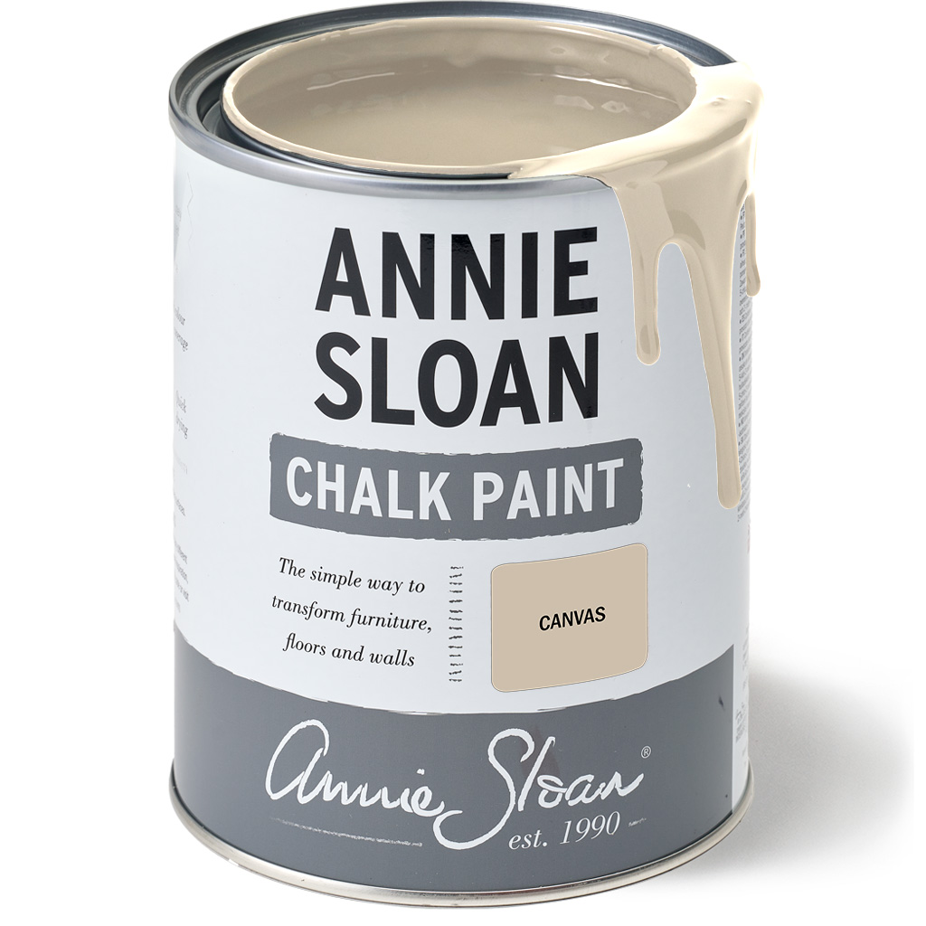 Canvas is a soft versatile colour that can be the star of the show or work with other colours as the perfect neutral. This organic putty-tinted shade is named after the shade you will find on a painter’s canvas. Canvas is a pale muted beige that will work as the perfect furniture paint in both contemporary and traditional interiors. Canvas is a neutral that will work with must interior design styles from rustic farmhouse to contemporary modern and sophisticated traditional. It pairs beautifully with natural materials like stone, wood and dark metals. Combine Canvas with many of our other neutrals to create a soft calming scheme. Try it with oatmeal and stone tones and earthy browns like Honfleur for a clean and contemporary look. This understated taupe shade with its warm undertones also works beautifully with the cooler greens and blues in the Chalk Paint palette – from the deep and bright colours to the more muted pastel colours. It is also a colour that works with earthy red such as Paprika Red and Primer Red, as well as Honfleur and Coco, together with our earthy pinks like Jaipur Pink and Antionette. JAIPUR CHALK PAINT 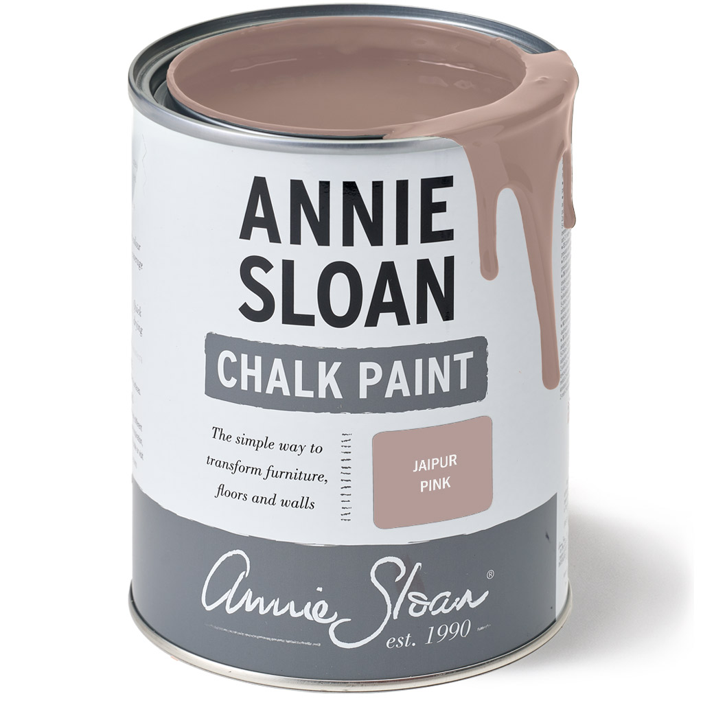 Jaipur in the heart of Rajasthan, India, is known as the Pink City because all the buildings are various shades of dusty ancient pink. Set in the midst of an area of incredible craftsmanship, Jaipur is an endlessly inspiring city and gave its name to this soft sophisticated pink. Jaipur Pink is a dusty earthy pink with a softness to it. Whilst it was inspired by India, this pink is everywhere in countries like France and Italy; it has the look of traditional plaster – slightly dirty and muted with a timeless olde-world quality. There is nothing Barbie about this pink! Jaipur Pink lightens to make other pinks or add Arles to make it more of an earthy ochre. In India it is a colour that works with earthy yellows, browns and reds like Old Ochre Honfleur and Primer Red. Use Jaipur Pink with warmer neutrals like Original, Old White and Rococo White for a cohesive sophisticated look. Jaipur Pink also works with strong colours like Tyrian Plum, Cambrian Blue and Olive to create fresh modern interiors. ROCOCO WHITE CHALK PAINT 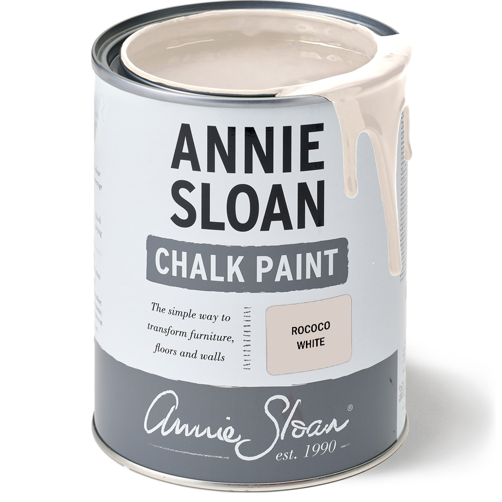 Rococo White is the softest white with a touch of Antionette to give it just a hint of pink. It a pretty neutral white that’s the essence of Rococo – the romantic style of art, architecture and decoration that began in France in the 1730s. Rococo style combined white and pastel colours with curves, gilding and frescoes and was pretty and gentle. Rococo White is reminiscent of the softest pink of the inside of a shell – delicate and pretty. The word rococo comes from the French word ‘rocaille” which was a method of decorating grottos and fountains using shells and pebbles. Rococo White has a frivolity and lightness about it. Use it with gold to create the opulence of an 18th century palace (think of Marie Antoinette’s dairy in the Palace of Versailles!). Mix Rococo White with other pastel colours like Antoinette, Louis Blue, Duck Egg Blue, Versailles and Svenska Blue and greys like Paris Grey and Chicago Grey. It works with a neutral like French Linen for a more traditional country house look or with gentled muted greens like Coolabah and Capability Green. SANDALWOOD RED CHALK PAINT 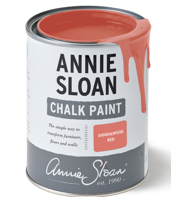 Sandalwood Red is a bright, lively colour that sits somewhere between pink and red. It was inspired by the colour of antique Chinese lacquered cabinets, chests and ginger pots, which are a strong dramatic shade of coral. Sandalwood Red is an optimistic joyful colour that feels fresh and modern. It’s a colour that will energise any space. Use Sandalwood Red with Athenian Black to create a traditional oriental look, which will look striking against a bright Carnaby Yellow wall. Sandalwood Red is also a colour which has a 1950s Palm Beach look. Think vibrant patterns, tropical vibes and off-beat happy bright sherbet colours. Use Sandstone Red with Provence, Capability Green, Paloma, Louis Blue and Coolabah Green for that retro Palm Springs laid back Beach Boys vibe. Used with Pure and Antoinette, Sandalwood Red looks vibrant yet mellow. TYRIAN PLUM CHALK PAINT 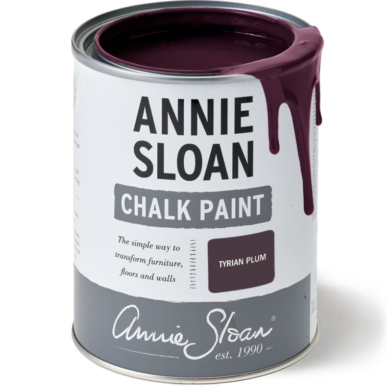 Annie describes Tyrian Plum is a wonderfully sophisticated earthy dark reddish-purple colour with real warmth and depth. Trish, The Purple Painted Lady describes it as a yummy, moody, dusty plum. This rich mellow aubergine colour has been making an appearance as a supporting shade for the past few years, but now it’s time for this rich jewel colour to take centre stage. Tyrian Plum’s warmth, ripeness and depth of pigment will flatter north-facing spaces and works especially well in intimate spaces like dining rooms and bedrooms. Tyrian Plum pairs beautifully with many different colours in the Chalk Paint palette. With classic neutrals like County Grey and Old White it will evoke neo-classical elegance. Blend with Honfleur and Burgundy with gold leaf details and set against an Olive or Pale Mallow backdrop for a dramatic look. Create a dark Victorian feel with jewel tones like Knightsbridge Green, or Amsterdam Green – or a contemporary look with Coolabah Green. The colour is named after Tyrian purple, a natural pigment extracted from sea snails in ancient times. The dye was also called royal purple or imperial purple and greatly prized in antiquity because it was so time-consuming and expensive to harvest. Chalk Paint® is the versatile furniture paint developed by Annie Sloan in 1990. With no need for sanding or priming, you can simply pop open the tin, roll up your sleeves, dip in your brush and apply paint to furniture. Works on wood, metal, laminate, concrete, indoors, outdoors and beyond.Breath a little spring into your spaces with these fresh new colors from Annie Sloan.  |