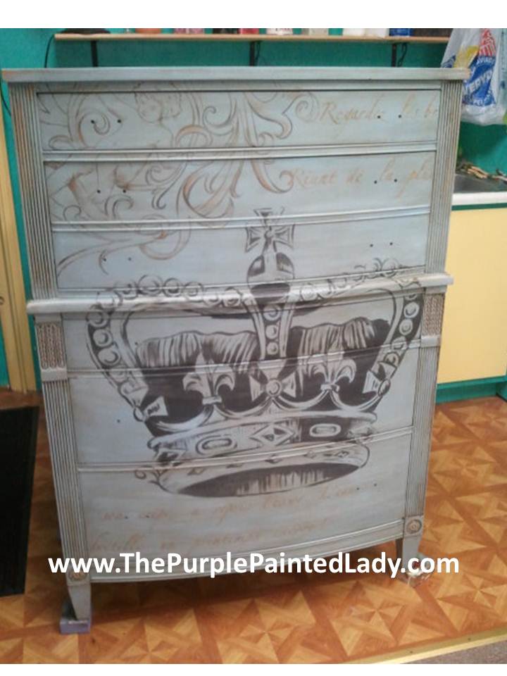
When it comes to adding typography to a piece, there are multiple ways to do it.
- PROJECTOR METHOD: Personally, I prefer using a projector. That is how I created most of the pieces you will see done by me, like this Coco dresser. I find this way the easiest since just by moving the projector closer or further away – I can manipulate the image to be bigger or smaller. It is also easy for me to combine different elements from various images, just by swapping out the transparency. Click HERE to read a post on “HOW TO” use a projector.
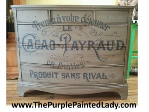
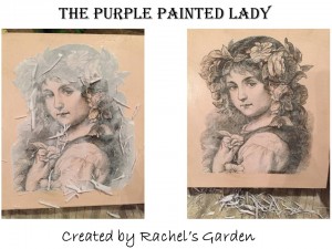
2. TRANSFER GEL METHOD: Or, some people prefer using a decoupage or transfer method. I find that this may not always be 100% reliable and it takes some skill. (well, I guess all methods take some skill, and I prefer option #1) But again, many of our customers like to use a transfer medium as described in this post HERE.
And then, we have ………..
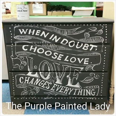
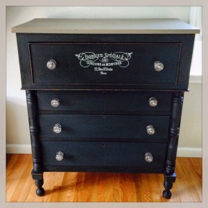
3. Super Chacopaper: Then, there is Meryl Gartside’s way. We were excited to see her “before & after” photos! And we think this dresser that Meryl painted for her husband turned out beautiful!
The Purple Painted Lady
Meryl wrote me:
About the dresser:
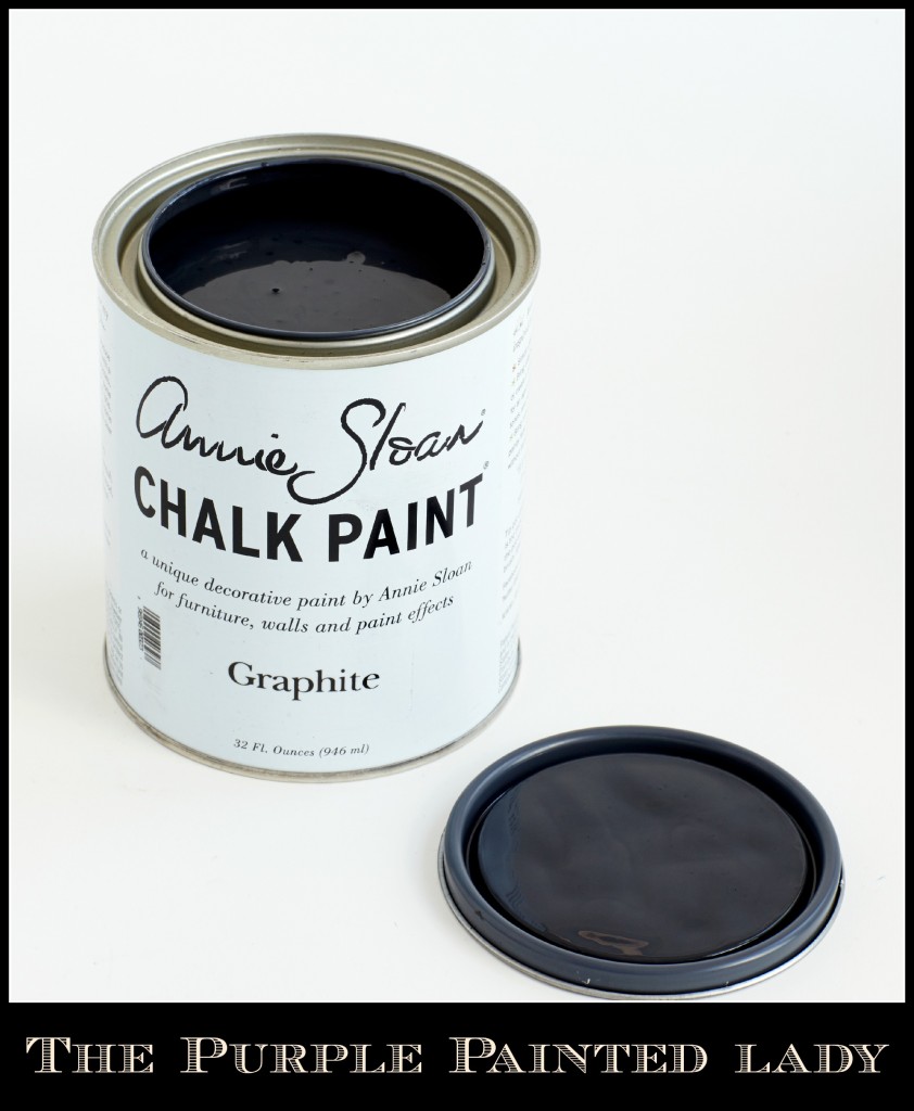
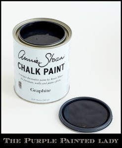
I did this piece to be used as my husband’s dresser in our newly remodeled bedroom. I chose the color Graphite because it seemed to be neutral and also a distinctly masculine color.
Graphite is a rich color – close to being a slate, or think …dark pencil lead. Depending on the orientation of the surface painted- it can appear darker or lighter. It does have depth and interest- and clearly plays wonderfully with other pieces painted in a true black. But note that it is NOT a true black.
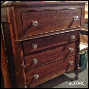
Here is the “BEFORE” picture of my Craigslist find:
The Purple Painted Lady
After cleaning (it with Mineral Spirits and doing a clean water rinse) – I then did a light sanding, and applied 2 coats of Graphite, slightly watering down the second coat because I was going for a smooth finish.
I did 2 coats of French Linen on the top, also adding a little water to the second coat for a smooth finish.
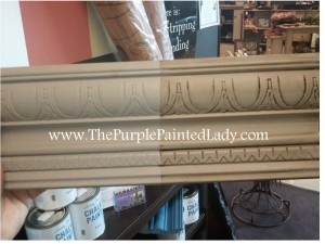
French Linen is an incredible color. To me it rivals a piece from Pottery Barn. It is a timeless & classic color. It has a bit of grey to it compared to a similar Chalk Paint® color, Coco. Coco is more brown.
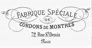
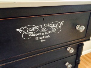
I found the typography on The Graphics Fairy.
The Purple Painted Lady
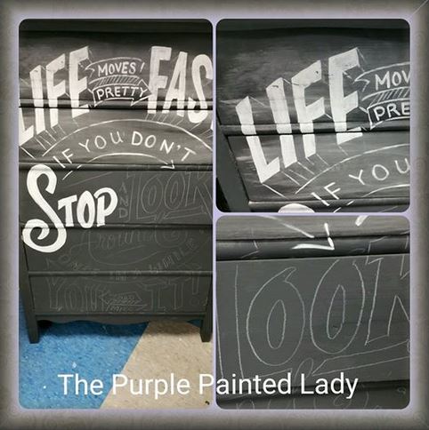
I enlarged the image to the size I wanted by making a Xerox copy at Staples. Then I found this amazing Super Chacopaper at Michaels which allowed me to trace (in white) an image onto a dark background.
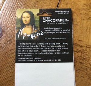
Meryl thinks this Chacopaper is great stuff! It somewhat “sticks” to the surface as you trace, so there is no way it will shift around. The one drawback is that it will smudge onto the surface below if you lean on it while you are tracing. I discovered this (horrified) when I peeked under the tracing the first time to make sure it was transferring the image. To prevent further smudging, I slipped a piece of parchment paper under where I was leaning on the surface, and re-positioned it out of the way as I traced my image. (The smudge which I had inadvertently created, wiped off easily later with water.)

The Purple Painted Lady
At this point, I took a break, and didn’t work on the piece for about 3 weeks. I had psyched myself out to the point where I was very nervous about painting the typography. Much time had already been invested, and I was afraid to mess up at this point.
Back at it 3 weeks later, I got up the courage to go over the typography with a fine point Sharpie Oil base paint pen. It wasn’t as difficult as I had feared, but I was ultra careful to avoid any blobs with the paint pen (my biggest fear) by dragging the pen tip on a sample board periodically (which had been painted in Graphite.) There were a few issues with the paint pen not flowing smoothly all the time, but I managed to avoid any major blobs on the actual drawer itself.
Once the typography was completed and dried, I waxed the dresser in a coat of Annie’s clear wax. I did some light distressing around a few edges, then gave everything a second coat of clear wax. I have read how dark wax makes graphite look even darker and richer and I had considered using it, but I was happy with the richness of the color just using the clear wax. Any white lines that were there from the chacopaper simply disappeared when I waxed it.
I used the original glass pulls for the drawers. Because they were over 100 years old they had gotten very cloudy. I soaked them in denture cleaner (a tip I discovered through research) and now they are bright and clear.
The Purple Painted Lady
Meryl wrote us, I want to say that from what I have found, you are the very best resource for chalk painting supplies and information on the Internet. I live in an area where there are no workshops near me. ? So, last winter when I set out to explore the world of chalk painting, your website (and online store) helped me more than any other single resource that I found. Thank you for that.
The Purple Painted Lady™ ~ the serial no. is 86/641,416 with the US Trademark Office
BUY PRODUCT FROM …..THE PURPLE PAINTED LADY™:
First- if you have a local stockist- go visit them and build a relationship with them. Go to them with your questions and project issues. BUT- if you do not have a local stockist- we invite you to try our customer service!
: ) And I will be here to help you as you progress through your future project! And if I do say so myself- we offer the BEST customer service that you will ever experience!Lastly- if I was helpful to you- ….please consider leaving a positive review on my Facebook business page sharing your positive experience or thoughts about The Purple Painted Lady. Here is a link to my Facebook page=> http://www.facebook.com/pages/The-Purple-Painted-Lady/291882785710 This really helps me! (wink, wink!)
PLEASE VISIT OUR TWO LOCATIONS!
our MAIN STORE at 77 West Main Street in Macedon, NY 14502
OR
3200 West Ridge Road in Rochester, NY 14626 (The Shops On West Ridge)


